Father’s Garden
1989: edition of 50
317 x 178 mm; 54 pp.
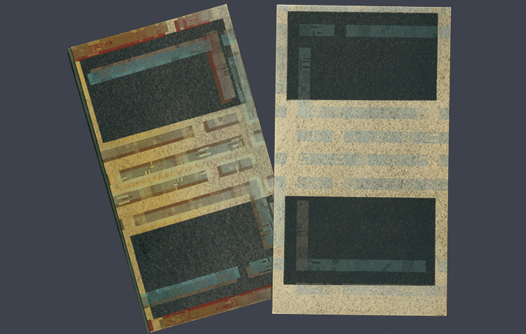
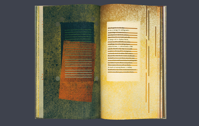
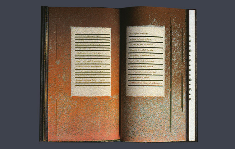
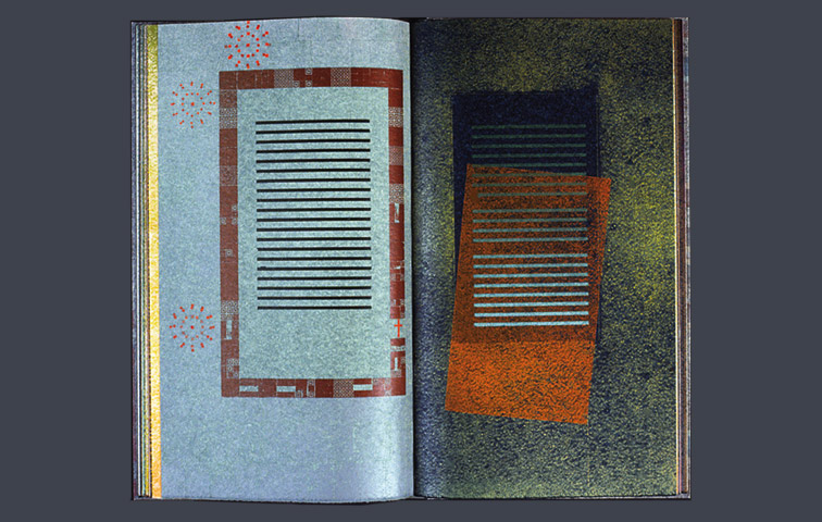
Printed letterpress in multiple inks, some metallic, on Zerkall Gehämmert paper, Chinese folded; some tints produced by hand-wiping, some pages varnished. Text and illustration composed of type and type ornaments. Printing from solids on the hammered peaks of the paper surface and varnishing; the resulting translucence blends the colours printed on each side of the paper. Typography and images composed of 12pt Bembo italic, Gill Sans extrabold, border materials, 6pt rules and raised mounting blocks.
Rabbi Luria of Sfad prayed at dawn in his garden when, he thought, the world was innocent of all sin. This book carries a poem about a ‘Father’s Garden’ that is used as a repeated image of a garden of exits and entrances; a garden of furrows of articulated alphabet from which much may grow; a sacred garden; a garden representing Jerusalem; a garden in which ‘Our father’s juice flows everywhere’. The poem is revealed on a page within the page: a plot within a plot.
The exits and entrances are eight possible typographic portals to the page. I asked a friend how many gates there were to the material Jerusalem while saying, aside, ‘Let there be eight’. ‘Lucky man’, he said later, ‘there are seven and one they don’t talk about’. As each cycle of the book is completed, a flowering made of decorative typographic elements occurs at these gates. The flowering is inspired by the design of Islamic books, and each carries successively the symbols of the three religions of the Book. The typographic rules are used as bars to represent a portcullis (that might yet be dismantled) to the gates of the City.
Each line of the poem is randomly shown when typographic lead rules – as furrows – are removed and set aside on the page. The line may then be seen as a happy representation of fruitful growth. Flat solids of colour representing the garden walk playfully about. The type that the poem is set in changes progressively from a brutal sans serif bold to a graceful, italic serif: this as a tilt towards the notion that the loosening of the strictly laid out and savagely managed garden of my/our father might yet produce happier fruit.
My father, despite his rigour, found everything that he planted in the ground spontaneously blossomed, intentionally or no. The lead rules as staves are shown at the end as Aaron’s rod all aflowering. Long may it be so.
Read review...
Father’s Garden
Reviewed by Cathy Courtney
Art Monthly, London, 1989
The design of ‘Father’s Garden’ reflects the tensions of the poem that is repeated throughout the book. The covers are stiff, every inch of their surfaces is taken, blocked in with colour – some of it delicate, some adamant. Inside, there are hardly any breathing spaces. The strict, upright pages are structured to provide a smaller, inner page whose boundary is limited by broader barriers of colour. In some cases the colour is trapped too, since it lies on the inside of the Chinese folds and is only partially visible. Bars recur through the book, sometimes acting as a shield to cover lines of verse. The bars also stand for the furrows in the garden of the title, a perfectly ordered enterprise. The father runs the garden with rigid efficiency, as if it were a ship. The analogy with the ship – presumably an allusion to his more active working past – is successful, emphasising the static frustration of a man at the end of his days hemmed in by physical limitations but with the same ambitions as he always had.
The other presence in the poem is that of the son, needing to escape the confines of the father’s world but nevertheless carrying the weight of his ancestry (his roots?) with him. Another garden makes an appearance early on in the book – the gates referred to are those of Jerusalem – opening up the landscape physically and culturally. But although the son does escape submersion to some degree, the injunction at the end of the poem is ‘remember home’, setting up a (perhaps unintended) echo of Eliot’s ‘Consider Phlebas’ in his ‘Waste Land’ adaptation of ‘Full fathom five’, an association reinforced by the connection with the sea and drowning. The battle for freedom – the son is absent without leave – however painful, is still tender and the softening of feeling is reflected in the colour and typeface which changes as the poem moves on. It begins in black sturdy type and moves into softer italics and the tones lighten to leafy green and end in harvest colours.
Perhaps it is only when the father himself is covered over with earth, that the son can look back with nostalgia to the vanished garden, his freedom become a kind of exile. On the last fold of the book another poem makes a shock appearance, the only part of the whole not fully integrated and prepared for from the beginning. Once more it juxtaposes nascent virility with a sense of ending, evoking the brevity of vigour versus the weight of the past and the waning of the natural cycle; the son moves closer to the absent father as he faces the same difficulties.
Click on image below to view gallery


