Firedogs
1991: edition of 33 plus 7 APs
380 x 254 mm; 86 pp.
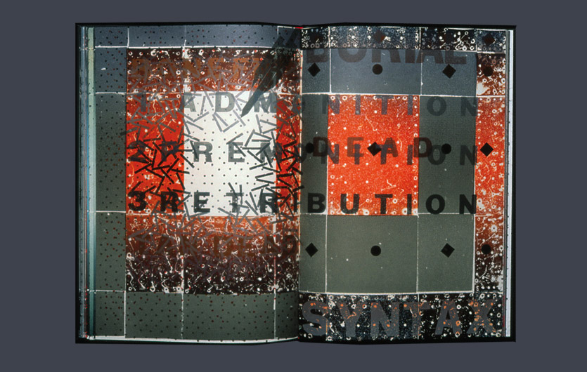
Printed by polychrome letterpress deploying hand-worked zinc plate, type-high nails and sandpaper. Set in Monotype Spartan, Stephenson Blake Bodoni and a variety of woodletter styles. Printed cover and slipcase.
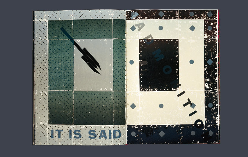
While progressively exploiting a traditional format for the book page, worn out pieces of type turned on their side and made type-high, the metal plates used for images and the usually unseen nails used to fix them, I tried to marry our world order of waste with an aesthetic of decay and lost form. The texts include brief Biblical quotations and six of my poems about waste in some of its modern forms in Bodoni type, set out rigorously to contrast with textual echoes in woodletter within the dark margins where can be found the admonition ‘want not, waste not’.
I took short phrases from each of the six poems and reversed their order in relation to those poems. I then placed the phrases in the dark margins of chosen pages (first done in ‘In the Door stands a Jar’). So with poem number one sat a phrase from poem number six; with poem number two a phrase from five, and so on until poem six had a phrase from one. The idea was that from the beginning the hidden phrases would be predictive of poetics to come and, increasingly towards the end, the phrases would echo what had been read during the journey through the book. I do not know if this device works.
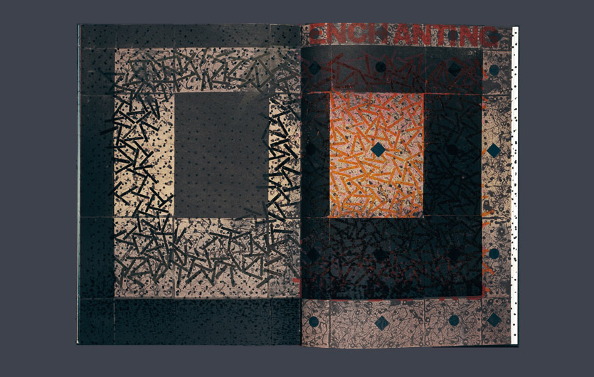
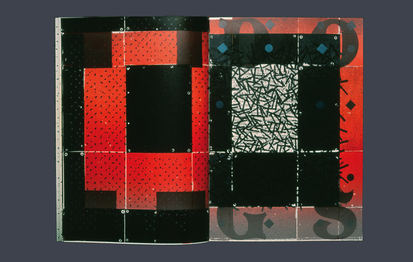
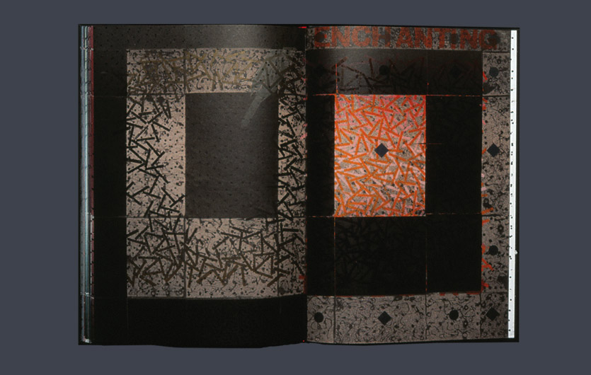
An arrangement of printing plates, drilled with holes and secured to their mounts by nails whose heads would not normally be high enough to print, was worked on in the bed of the press with a small modelmaker’s drill to give almost calligraphic, negative marks when printed. This process was pursued through the progress of the book until the plates registered accelerated decay (another process first employed in ‘EXECUTION’). An old problem for the judgemental has been that the negative, frightening, ugly and sinister can yet produce beauty. The final pages hint at this difficult truth and also at the page as a painter’s format. From dung may roses grow.
At the beginning and at the end the aforementioned nails are set to a pattern and printed to suggest mechanisation and the dirt of flies, the spoor of Satan. Three thunderbolts, courtesy of Jove, increasingly resemble rockets, F16s, or stinging scorpions. ‘Firedogs’ was started during the First Gulf War.
Read review...
Reviewed by Cathy Courtney
Art Monthly, London, 1991
‘Firedogs’ is a rich, dark, bloody book, full of threat and doom and yet intimating redemption by virtue of its own coherence and integrity. As before, Campbell entwines violence and sensitivity not only in his subject matter but in the treatment of the materials (sandpaper included) which have been dragooned into use in the printing process; that there are seven artist’s proofs is partly due to the force which Campbell applied whilst the book was on the press, causing several sheets of paper to crack at the edges.
Ironically, one of the quieter images – black shapes like nascent tadpoles swimming against a rose background – was achieved by directing a drill to bore and skid across the surface of the metal printing blocks. The image which punctuates the poem in the ‘abstract’ version was produced by turning bits of type onto their sides and printing from the surface usually never seen and, as well as introducing different tones which fade and grow strong across the page, the formation was altered as bits flew off the stubs of type crushed beneath the weight of the machinery. Part of the thinking behind ‘Firedogs’ was to create disorganisation out of the very elements usually used in an orderly fashion to construct a book, subverting the clean, careful processes into a controlled explosion… The seriousness and irrevocability of the crime which robs form of its natural life, leaving it broken and tortured, is a theme which haunts the book’s language both literal and visual…
The tension between the work’s harsh and gentle forces begins early on. The cover of the ‘abstract’ is made up of tightly regimented, claustrophobic black sections such as Campbell has used in the past, but the title appears in large, romantic lettering, taken from woodblocks which have a gothic echo, and the first inner pages are an unexpected shade of apricot leading the eye and touch towards the fine off-white paper which makes up the rest of the book… The first jolt of the main volume is finding the seductive pinks and reds which enrich the cover, discovered nestling like soft flesh beneath armour, as the book slips out from a hard box which sports blacks, golds, nail-heads and what look like metal plates, and this vulnerability is picked out again in the text with words like ‘belly’ recurring several times amid the tales of destruction. The first and last images are of a dark rain of tears, in fact formed from overprinting a constellation of nail-heads as many as a dozen times, but the intervening journey takes place on concentrated blocks of colour which remain distinct and abut one another with equal vehemence, like bulls locked in paralysed combat…
Campbell’s muscular language powers one through the book, the impact all the greater for amalgamating the violent story with the printing process itself.
Click on image below to view gallery


